Why Choose a Touch Screen Vending Machine?
Why Choose a Touch Screen Vending Machine? The answer begins with a more natural customer experience. A bright screen can display product images, prices, ingredients, and availability within seconds. Shoppers can tap, compare, and complete purchases without searching through small buttons.
Jakob Nielsen, a recognized usability authority in interactive self-service design, explains, “Usability is a quality attribute that assesses how easy user interfaces are to use.” This principle matters inside a busy station, hospital, university, or office lobby. A well-designed Touch Screen Vending Machine should guide users with large icons, clear contrast, simple language, and immediate payment feedback. It should also support accessibility, multiple payment methods, and remote inventory monitoring. These features help operators reduce confusion and respond faster when popular items sell out.
The technology is not perfect. Screens can feel intimidating to some users, especially when menus become crowded or instructions move too quickly. A reliable machine still needs physical protection, regular cleaning, stable connectivity, and human oversight. Small failures matter. A delayed payment message can make a customer abandon the purchase.
The strongest case for a Touch Screen Vending Machine is practical, not flashy. It can create a cleaner buying path, provide useful product information, and give operators better visibility into daily demand. However, success depends on thoughtful design and consistent maintenance. A screen alone does not improve service. The surrounding experience must earn trust.
What Is a Touch Screen Vending Machine?
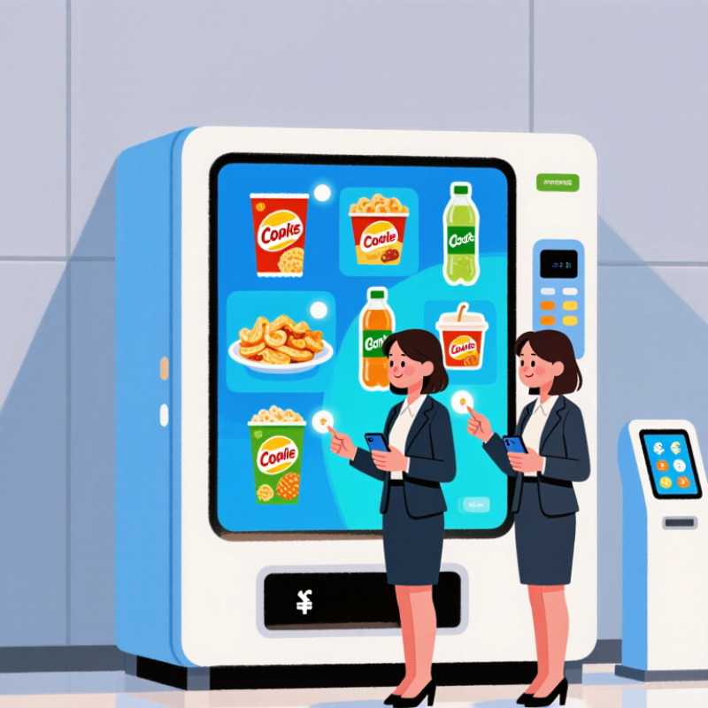
A touch screen vending machine is an automated cabinet with a digital display for browsing and selecting products. Instead of relying on a row of fixed buttons, it shows choices as pictures, names, prices, or category tiles. When a customer taps an item, the machine checks its settings and guides the next step, such as confirming the selection or choosing a payment method. A controller connects the screen with the product mechanism and, where available, payment and inventory systems. The exact features vary by machine. The screen is the interface. Products stay inside.
This setup can make a large menu easier to browse. For example, a customer might tap “drinks,” compare bottle sizes, and see the price before making a choice. Operators may also update product information through the machine’s software, depending on its configuration. Clear labels and readable text matter more than flashy graphics. A touchscreen is not automatically easier for everyone: glare, small text, or slow responses can frustrate users. A physical button can sometimes be quicker. The design needs testing in the actual location, where lighting, reach, and customer habits can expose flaws that a clean demo misses.
How Does a Touch Screen Vending Machine Work?
A touch screen vending machine works through a small computer that links the display, payment reader, and product dispensers. While idle, the screen shows available items, prices, and selection prompts. A shopper taps a product to view its cost or options. The choices should be clear and readable, even under bright overhead lights.
After selection, the machine requests payment through its configured reader. Once payment is approved, its controller activates the matching motor or release mechanism. A spiral may turn, or a compartment may unlock. Sensors can check whether the item dropped into the pickup area. If delivery fails, the machine may stop the transaction flow and display instructions; exact refund handling depends on its setup. Small, but important.
Behind the display, inventory data helps the system mark sold-out selections and record sales. Operators can use those records to plan restocking, though sensor readings are not always perfect. A product can shift without being detected. The screen also needs regular cleaning and software checks, since smudges or slow responses can make a simple purchase frustrating. Touch control feels intuitive, but it still depends on reliable hardware and well-tested prompts.
Which Features Improve the Customer Experience?
A touch screen vending machine can make choosing a product feel clear rather than hurried. Large, well-spaced buttons help customers browse without tapping the wrong item. Sharp product photos, readable prices, and visible stock status reduce guesswork. Keep the layout simple. Too many categories can turn a quick purchase into a chore.
Useful screens guide customers through each step, from selecting an item to confirming payment. A clear progress indicator shows what comes next, while plain-language error messages explain how to recover from a declined payment or an unavailable product. Small details matter. Showing ingredients or basic product information can help people make informed choices, provided the details stay accurate and current. A receipt option and a discreet payment flow also make the interaction feel more comfortable.
The screen should work in its actual setting, not just in a design mockup. Bright sunlight can wash out text, and small controls may be awkward for customers with limited dexterity. Test the display at different angles and lighting levels. Offer a visible way to cancel or return to the menu. Touch interfaces are not perfect; a slow response can frustrate people, so regular checks and a simple fallback process are worth planning.
What Benefits Does It Offer Businesses?
Why Choose a Touch Screen Vending Machine?
What Benefits Does It Offer Businesses?
A touch screen vending machine can make buying quicker and product choices easier to understand. Shoppers can browse clear photos, prices, and ingredient details before making a selection. Less guesswork. For businesses, digital menus can be updated when prices or available products change, without replacing printed labels. A well-organized screen may also highlight related items, such as a drink beside a snack, while keeping the choice optional.
The screen can support smoother operations, too. Sales reports may show which products move quickly and which sit untouched. Staff can use that information to adjust stock levels and plan restocking visits. For example, a machine near a busy office entrance may need different products than one in a quiet waiting area. Better decisions, potentially. Data is useful, but it should be checked against real conditions; a single unusual week can distort demand.
There are trade-offs. A screen can freeze. Businesses need a clear process for reporting faults, maintaining the machine, and keeping payment options usable. The interface should use readable text and simple steps, since not every customer is comfortable navigating menus. Touch screens also need regular cleaning, especially in shared spaces. A little upkeep is easy to underestimate. Before choosing one, consider who will use it, where it will stand, and who will respond when something goes wrong.
Why Choose a Touch Screen Vending Machine? – What Benefits Does It Offer Businesses?
| Business Consideration |
Potential Benefit |
How It Works |
Practical Consideration |
| Product discovery |
Makes a larger or varied selection easier to browse. |
On-screen categories, product images, and search functions can help customers locate items. |
Keep menus organized and images consistent with the items being sold. |
| Product information |
Can provide more information at the point of purchase. |
Screens can display descriptions, ingredients, allergen details, or other relevant product information when configured. |
Information should be accurate, legible, and kept up to date. |
| Promotions and recommendations |
Creates space to highlight offers or related products. |
Promotional panels and suggested add-ons can be shown during browsing or checkout. |
Promotions need clear terms, accurate pricing, and regular review. |
| Payment experience |
Can guide customers through available payment choices. |
A touch interface may work alongside supported card, mobile, or cash payment options. |
Payment methods depend on the machine configuration, connectivity, and payment provider. |
| Menu updates |
Allows on-screen content to be changed without replacing printed labels. |
Operators can update product listings, prices, or promotions through the machine's management system, where available. |
Remote updates require compatible software and a reliable connection; some systems require local changes. |
| Sales and inventory insight |
May help operators make better-informed restocking decisions. |
Connected systems can record transactions and, when supported, report sales or stock status. |
Reporting detail varies by system, and recorded data needs to be reviewed and interpreted. |
| Customer experience |
Offers a guided, interactive alternative to button-based selection. |
Visual menus and step-by-step prompts can make product selection and checkout easier to follow. |
Use readable text, clear contrast, responsive controls, and a simple checkout flow. |
| Operating costs and upkeep |
Digital menus can reduce reliance on printed promotional materials. |
Content changes can be made digitally when the machine supports editable menus. |
Compare purchase price, software or connectivity fees, cleaning needs, and repair support before investing. |
Benefits depend on the machine's features, product range, location, connectivity, and how well the interface is maintained.
How Should You Choose the Right Touch Screen Vending Machine?
How Should You Choose the Right Touch Screen Vending Machine?
Choosing a touch screen vending machine starts with the selling environment, not screen size. Grand View Research valued the global vending machine market at about USD 18.9 billion in 2022. This growth increases equipment choices, but also makes comparison harder. Measure daily transactions, product dimensions, indoor temperature, lighting, and available floor space. A machine near a sunny entrance needs strong brightness and anti-glare protection. One in a quiet office may need a smaller display and lower power use.
Payment flexibility matters. The Worldpay Global Payments Report 2024 found that digital wallets represented about 30% of global point-of-sale spending in 2023. Choose a system supporting contactless cards, mobile wallets, and reliable fallback payments. Check transaction security, software updates, and offline recovery before purchase. NAMA’s 2023 census reported approximately USD 31.1 billion in U.S. convenience-services revenue, showing the importance of dependable daily operation. Ask for real service-response times, spare-part availability, and remote fault alerts.
The interface should be simple. Test it with one hand. Large buttons help, but oversized menus can slow purchasing. Accessibility features, clear pricing, multiple languages, and adjustable contrast are practical requirements. Review sales reports, inventory alerts, temperature records, and integration options with your existing system. A cheaper machine may consume more electricity or require frequent technician visits. I would request a live demonstration using your actual products. Screens look impressive in showrooms. Real queues expose weak design. A perfect forecast is unlikely, so leave room for learning.
Why Choose a Touch Screen Vending Machine?
Illustrative decision-priority ratings (1–5), not survey results.
Touch screens can make product browsing and payment options easier to navigate. When choosing a machine, compare the interface and accessibility alongside payment compatibility, maintenance needs, and total cost.